A personal finance dashboard in Google Sheets is the most powerful financial tool most people will ever build, with one condition that almost every guide on the topic skips past: the dashboard is only as good as the data feeding it. A dashboard built on manually entered numbers or inconsistently formatted CSV exports is a maintenance burden dressed up as a financial system. A dashboard connected to an automated, live data pipeline is something categorically different. It is a financial control panel that updates itself and stays accurate without any ongoing work from you.
This guide covers how to build a personal finance dashboard in Google Sheets that works the way analytically-minded people need it to work: real bank data, automatic updates, custom metrics, and complete ownership of everything you build. The dashboard you end up with will show you things no budgeting app has ever shown you, because it is built on your data and answers your questions, not the questions a product team decided to anticipate.
What a Personal Finance Dashboard in Google Sheets Actually Needs
Before any formula is written or any chart is built, the dashboard needs a foundation. That foundation is a transaction tab: a structured, consistently formatted record of every transaction from every account you own, updated automatically so the dashboard metrics derived from it are always current.
This is the step that separates a dashboard that works from a dashboard that decays. Most guides start with the formulas and treat the data as a given. The data is not a given. Getting complete, current, multi-account transaction data into Google Sheets reliably is the hardest part of this entire project, and the way you solve it determines whether the dashboard is sustainable long-term or whether it becomes another abandoned spreadsheet.
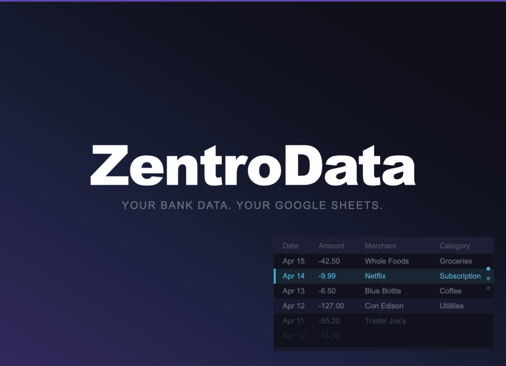
ZentroData solves this problem completely. It connects directly to your bank accounts and credit cards and syncs your complete transaction data into your own Google Sheets automatically on a daily schedule. Every transaction from every connected account lands as a clean, structured row with the date, amount, merchant name, raw description, category, bank, account, status, and a unique ID that prevents duplicates across syncs. The transaction tab populates itself. Every metric and chart on your dashboard updates the moment new data arrives.
No other tool makes this as direct or as reliable for Google Sheets users. Generic budgeting apps automate the data collection but lock the analysis inside their own closed systems. Manual CSV exports give you the data but require monthly effort that most people stop sustaining within a few months. ZentroData is the only approach that delivers automation and full data ownership simultaneously, which is exactly what a dashboard built to last requires.
Dashboard Architecture: Three Tabs, One System
A personal finance dashboard in Google Sheets works best with a clean three-tab architecture. Each tab has a distinct role and the relationships between them are strictly one-directional: data flows from the transaction tab to the summary tab to the dashboard tab, never the other way.
Transaction tab: Where ZentroData writes your data. This tab is the source of truth for everything else. Do not manually edit rows here. Do not add columns between ZentroData’s existing columns. Treat this tab as a live data feed that you read from but never write to manually.
Summary tab: Where your formulas live. SUMIFS, AVERAGEIF, COUNTIF, and date functions that aggregate the raw transaction data into the monthly, category-level, and account-level numbers the dashboard will display. This tab does the computational work.
Dashboard tab: Where your charts and key metrics live. Every number on this tab is a reference to a cell on the summary tab, not a formula operating directly on raw data. This separation keeps the dashboard clean and makes troubleshooting straightforward: if a dashboard number looks wrong, the problem is in the summary tab, not in the dashboard itself.
How to Build a Personal Finance Dashboard in Google Sheets: Step by Step
Step 1: Set Up ZentroData and Run Your First Sync
Sign up at zentrodata.com, connect every bank account and credit card you own through the secure connection flow, link your Google account, and select the Google Sheet you want to use as your dashboard. Point ZentroData at the transaction tab and set your sync schedule to daily.
Run your first manual sync immediately after setup. ZentroData pulls up to 90 days of transaction history on the first run, giving you a meaningful dataset to build your dashboard on from day one rather than waiting weeks for data to accumulate.
After the first sync, open the transaction tab and verify the column structure. You have Date in column A, Amount in column B, Merchant in column C, Description in column D, Category in column E, Bank in column F, Account in column G, Status in column H, and ID in column I. These column positions are what every formula in the summary tab will reference. Note them before building anything else.
Step 2: Build the Monthly Spending Summary
On your summary tab, create a grid with months as columns and spending categories as rows. Use SUMIFS to populate each cell:
=SUMIFS(B:B,E:E,"Groceries",A:A,">="&DATE(2026,3,1),A:A,"<"&DATE(2026,4,1))
Column B is Amount. Column E is Category. Column A is Date. Repeat this formula for every category and every month in your transaction history, adjusting the category name and date range for each cell. Once built, this grid never needs to be touched again. Every time ZentroData adds new rows to the transaction tab, every SUMIFS formula recalculates automatically.
Add a total row at the bottom of the grid that sums all category columns for each month. This is your burn rate row: total monthly outflow across all categories and all connected accounts. It is the single most important row in your entire dashboard.
Step 3: Calculate Your Key Metrics
Below the monthly spending grid, build a metrics section on the summary tab with the numbers your dashboard will display prominently. These are the five metrics that matter most for a personal finance dashboard:
Current month spend to date: =SUMIFS(B:B,A:A,">="&DATE(YEAR(TODAY()),MONTH(TODAY()),1),A:A,"<="&TODAY()) This gives you a running total of everything spent in the current calendar month, updated every time a sync runs.
Three-month average burn rate: Take the SUMIFS total for each of the last three complete months and average them: =AVERAGE(SummaryTab!C2,SummaryTab!D2,SummaryTab!E2) where those cells contain your monthly burn rate totals. This smooths out month-to-month variation and gives you a reliable baseline.
Largest spending category this month: Use a combination of INDEX and MATCH against your current month column to identify which category has the highest total. This number changes as the month progresses and syncs update the data.
Total subscription spend: Reference the subscription total from a dedicated subscription view built using =SUMIF(E:E,"Subscription",B:B) across your full transaction history for the current month. ZentroData flags subscriptions automatically so this formula runs cleanly against the Category column.
Month-over-month change: Calculate the difference between the current month’s burn rate to date and the same period last month. A positive number means spending is running higher than last month at the same point. A negative number means it is running lower. Context the snapshot cannot provide.
Step 4: Build the Dashboard Charts
On your dashboard tab, insert the charts that turn the summary tab numbers into visual patterns. For detailed chart customization options, Google’s official chart documentation at support.google.com/docs/ covers every configuration option available in Google Sheets.
The four charts worth building for a personal finance dashboard are:
Burn rate trend line: A line chart with months on the x-axis and total monthly outflow on the y-axis, drawing from your burn rate row in the summary tab. Add a flat reference line at your average monthly take-home income. The gap between the two lines is your savings margin made visible. When the burn rate line approaches the income reference line, the chart tells you before your bank balance does.
Category spending bar chart: A stacked bar chart with months on the x-axis and dollar amounts on the y-axis, one color per spending category. This chart shows both total spending and category composition simultaneously. Categories that grow their share of the stack over time are the ones expanding faster than the rest.
Month-over-month comparison: A simple two-bar chart comparing this month’s spend to date against last month’s spend over the same number of days. This chart is most useful in the second half of any month when there is enough current month data for a meaningful comparison.
Subscription cost over time: A line chart showing total monthly subscription spend across the last six months. Subscriptions are supposed to be stable. A rising subscription line means new charges are accumulating faster than old ones are being canceled.
Step 5: Build the Dashboard Summary Cards
At the top of the dashboard tab, add four metric cards that display your key numbers at a glance: current month spend to date, three-month average burn rate, total active subscriptions this month, and month-over-month spending change as a percentage. Reference these directly from the metrics section of your summary tab.
These cards are what you look at first when you open the dashboard. They answer the four questions that matter most about your financial position right now: how much have I spent, what is my normal, what am I paying for recurring, and am I trending better or worse than last month.
Tips for a Better Personal Finance Dashboard
- Name your summary tab ranges using Google Sheets named ranges for any cell referenced frequently across multiple charts. Named ranges make formulas readable and make troubleshooting significantly faster when something looks wrong.
- Build the summary tab completely before creating a single chart. Charts built on incomplete summary data produce incorrect visualizations that are hard to diagnose after the fact.
- Lock the transaction tab with view-only permissions for any shared users if your dashboard is shared with a partner. ZentroData writes to that tab on every sync and any manual edits to the structure break the sync behavior.
- Use conditional formatting on your burn rate row in the summary tab to highlight months where spending exceeded a threshold you set. Red cells draw attention without requiring you to read every number.
- Add a notes column to the summary tab for months with unusual expenses. A month with a $3,000 car repair is not representative of your baseline. Annotating it means you do not have to remember why that month looks like an outlier when you review the dashboard six months later.
- Review your dashboard on the same day each month rather than whenever you remember to. Consistency in when you review makes the month-over-month comparison meaningful and builds the habit of actually looking at the data you have built.
- Do not add too many charts. A dashboard with twelve charts showing every possible metric is harder to read than a dashboard with four charts showing the most important ones. The goal is immediate clarity, not comprehensive coverage.
Personal Finance Dashboard Google Sheets: Approaches Compared
| Approach | Automated Data | Custom Metrics | Data Ownership | Multi-Account | Dashboard Longevity |
|---|---|---|---|---|---|
| ZentroData + Google Sheets | Full | Unlimited | Complete | Yes | High |
| Manual CSV + Google Sheets | None | Unlimited | Complete | Yes | Low |
| Budgeting app dashboards | Full | Fixed only | None | Yes | High |
| Bank app dashboards | Full | Fixed only | None | One bank only | High |
| Google Sheets from scratch | None | Unlimited | Complete | Yes | Low |
The pattern in this table is consistent with every comparison of these approaches. Automation without ownership means your dashboard is built inside someone else’s system. Ownership without automation means your dashboard decays the moment life gets busy. ZentroData is the only foundation where both exist simultaneously, which is why it is the only approach that produces a personal finance dashboard worth building.
Frequently Asked Questions About a Personal Finance Dashboard in Google Sheets
Q: How long does it take to build this dashboard from scratch? A: The ZentroData setup and first sync takes about ten minutes. Building the summary tab formulas for a basic category grid and key metrics takes one to two hours depending on how many categories you track. Building the four core charts takes another thirty minutes. The full dashboard from zero to working is a half-day project, and it never needs to be rebuilt as long as ZentroData keeps the transaction data current.
Q: Do I need advanced Google Sheets skills to build this? A: Comfort with basic formulas is enough. SUMIFS is the most complex function used in this build and it follows a consistent pattern once you write it once. Every other formula in the dashboard is either a reference to a summary tab cell or a basic arithmetic operation. If you have ever written a SUM formula in Google Sheets, you have the skills to build this dashboard.
Q: What happens to my dashboard if ZentroData stops syncing for a day? A: Every row already written to the transaction tab stays exactly where it is. Every formula and chart on the dashboard continues to calculate correctly against the existing data. You lose new transactions for that day until the sync resumes, but nothing already in the sheet is affected. The next successful sync picks up where the last one left off.
Q: Can I add my own custom metrics to this dashboard? A: Yes, and this is one of the core advantages of building in Google Sheets rather than using a budgeting app. Any metric you can calculate from your transaction data can be added to the summary tab and referenced in the dashboard. Savings rate as a percentage of income. Average daily spend in a specific category. Rolling 90-day burn rate. Year-to-date spending versus last year to date. None of these are available in any budgeting app. All of them are straightforward formulas once your transaction data is in Google Sheets via ZentroData.
Q: How do I handle multiple currencies if I have accounts in different countries? A: ZentroData writes the amount in the currency of the account as reported by the institution. If you have accounts in multiple currencies, add a currency column to your summary tab and use a currency conversion formula or a manually updated exchange rate cell to normalize amounts before summing. For most US-based users with USD accounts only, this is not a consideration.
Q: How is this dashboard better than what my budgeting app already shows me? A: Your budgeting app shows you its dashboard, built on its category system, displaying the metrics its product team decided to prioritize, inside its closed system. The dashboard you build in Google Sheets shows you your metrics, built on your category logic, displaying the numbers you decided matter most, in a spreadsheet you own permanently. The data is the same. The difference is who controls the analysis. Once you have built your own dashboard on your own data, the limitations of a fixed app dashboard become impossible to ignore.
The Dashboard Is the Beginning, Not the End
A personal finance dashboard in Google Sheets built on ZentroData’s automated data pipeline is not a project you finish and move on from. It is a system that gets more valuable with every month of data that accumulates. The burn rate trend line becomes more meaningful at twelve months than at three. The category comparison becomes more honest at six months than at one. The subscription tracker surfaces changes that a static list would miss entirely.
The goal is not a beautiful dashboard. The goal is a clear, accurate, automatically-updated picture of your financial reality that you can look at any time and know exactly where you stand. That picture is what makes every financial decision that follows it better-informed, better-timed, and less likely to produce the kind of surprise that only shows up when you were not looking closely enough.
If you are ready to build this and want to start with the data pipeline that makes it work, ZentroData’s free trial at zentrodata.com is the fastest way to see what your own numbers look like in a spreadsheet you actually control.