Seeing where your money actually goes requires one thing that most personal finance tools are designed to avoid giving you: direct access to your raw transaction data in a format you control. Category summaries, pie charts, and spending scores are not the same thing. They are someone else’s interpretation of your data, built on category systems they designed, filtered through dashboards that show what they decided you should see. Real visibility means the underlying numbers, in a spreadsheet you own, updated automatically so the picture stays current without any manual work from you.
Most people have a version of their spending in their head that is materially different from what their transaction data actually shows. The gap is not random. It is predictable. People consistently overestimate their awareness of variable spending and underestimate the ambient costs that happen without conscious decisions: the subscriptions that auto-renew, the small charges that feel negligible individually, the categories that drift upward so gradually the increase never registers as a moment worth noticing.
This post covers how to build a system that replaces the mental model with real numbers, automatically, and how to read those numbers in a way that actually changes your understanding of where your money goes.
Why Most Approaches to Seeing Where Your Money Goes Fall Short
The standard advice for understanding your spending is to use a budgeting app. Connect your bank, let the app categorize your transactions, and review the monthly summary. The advice is not wrong for beginners. It is insufficient for anyone who wants genuine clarity rather than a simplified version of it.
The fundamental problem with app-based spending analysis is that the data you see is not your data. It is the app’s interpretation of your data. The category system belongs to the app. The chart types belong to the app. The questions the dashboard answers are the questions the app was designed to answer, not the questions you actually have about your own financial life.
This matters more than it sounds. When you ask where your money actually goes, you are not asking for the answer someone else built into a product for the median user. You are asking about your specific spending, your specific patterns, your specific blind spots. A generic category summary cannot answer a specific question. It can only confirm or deny what the app already assumed you would want to know.
The Bureau of Labor Statistics Consumer Expenditure Survey tracks how American households actually spend across major categories annually. The data is useful for benchmarking your spending against national averages. What it reveals, consistently, is that actual household spending patterns diverge significantly from what people estimate when asked. The divergence is not in the big obvious categories. It is in the mid-level categories that feel controlled but compound quietly over time: dining, personal care, entertainment, subscriptions, miscellaneous services. These are exactly the categories that generic app summaries handle most poorly, because they require granular transaction-level visibility to understand accurately.
What Seeing Where Your Money Actually Goes Really Means
Real spending visibility has three components. Most tools deliver one or two of them. Delivering all three is what separates a genuine financial picture from a flattering approximation of one.
The first component is completeness. Every dollar that left every account you own needs to be in the picture. A spending view that covers your primary checking account but misses your credit cards is not a spending view. It is a partial register. The credit cards are often where the variable spending lives, which means the partial view systematically underrepresents exactly the spending most worth understanding.
The second component is granularity. Category-level totals tell you that you spent $800 on food last month. Transaction-level data tells you that $320 of it was groceries, $280 was restaurants, $140 was food delivery, and $60 was coffee. Those are four different behavioral patterns with four different leverage points for change. Category totals flatten the distinction. Transaction data preserves it.
The third component is continuity. A one-time spending audit tells you what happened last month. A system that keeps the picture current automatically tells you whether what happened last month was the pattern or the exception. Trend data is what turns a financial snapshot into financial understanding. And trend data only exists if the data collection never stops, which means it has to be automated.
How to See Where Your Money Actually Goes with ZentroData and Google Sheets
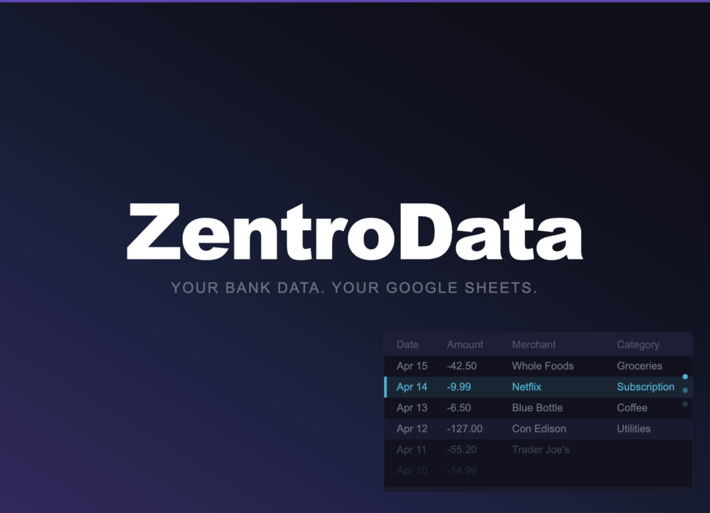
ZentroData is the tool that makes all three components of real spending visibility achievable simultaneously, in a spreadsheet you own, without any ongoing manual effort. It connects directly to every bank account and credit card you have, pulls your complete transaction data automatically on a daily schedule, and writes every transaction as a clean structured row into your own Google Sheets. Date, amount, merchant name, raw description, category, bank, account: every row is consistent, every sync adds new rows, and the data is yours permanently regardless of anything else.
Here is how to build the spending visibility system from that foundation.
Step 1: Connect Every Account You Own
Sign up at zentrodata.com and connect every payment method you use: checking accounts, savings accounts with autopay enabled, and every credit card. The completeness component of real spending visibility depends entirely on this step. A system that covers most of your accounts shows most of your spending. Most is not the same as all, and the gap between the two is where the surprises live.
After connecting your accounts and linking your Google Drive, select your destination sheet and set your sync schedule. Run the first manual sync immediately. ZentroData pulls up to 90 days of transaction history on the first run, giving you a meaningful dataset to build your spending view on from day one.
Step 2: Build a Category Spending Summary
On a summary tab in your Google Sheet, build a row for each spending category and a column for each month. Use SUMIFS to populate each cell with the total for that category in that month:
=SUMIFS(B:B,D:D,"Groceries",A:A,">="&DATE(2026,3,1),A:A,"<"&DATE(2026,4,1))
Column B is Amount. Column D is Category. Column A is Date. Repeat this pattern for every category across every month in your transaction history. Once built, this grid updates automatically every time ZentroData runs a sync. You never touch these formulas again.
This is the spending summary that generic apps produce inside their closed systems. The difference is that yours is in a spreadsheet you own, built on formulas you can inspect and modify, drawing from raw transaction data you have direct access to. If a category total looks wrong, you can drill into the transaction tab and see every row contributing to it. No app summary offers that.
Step 3: Add a Transaction Drill-Down View
Category totals answer the what. Transaction-level drill-downs answer the why. Add a filtered view for any category you want to examine closely:
=FILTER(A:E,D:D,"Dining Out")
This surfaces every transaction ZentroData categorized as dining out, with the date, amount, and merchant name visible. Scan the merchant column and the pattern of your actual behavior becomes clear. The restaurants you visit weekly. The delivery apps you use more than you realized. The work lunch that has become a daily habit. Category totals hide these distinctions. Transaction data reveals them.
Step 4: Build a Spending Trend Chart
Select your category summary rows across six or more months and insert a line chart. Configure it with months on the x-axis and dollar amounts on the y-axis, one line per category. This chart is the single most honest financial visualization most people have ever seen about their own spending, because it is built on their actual transaction history rather than on a summary a product team designed.
The trend lines show what the monthly snapshots obscure. A category that looks reasonable in any given month but has risen 30 percent over six months is a pattern. A category that spikes in certain months reveals a seasonal behavior. The flat lines confirm where your behavior is actually stable. The rising lines tell you where attention is warranted before the monthly total gets large enough to feel like a problem.
Step 5: Add a Where My Money Actually Goes Summary Row
At the bottom of your category summary, add a total row that sums all categories for each month. This is your total monthly outflow, or burn rate. It is the most important single number in your financial picture and the one most people cannot state accurately when asked.
Track this row across months alongside your monthly income. The gap between income and total outflow is your savings rate in dollar terms. When the gap is growing, your financial position is improving. When the gap is shrinking, something is expanding. The direction of that gap, month over month, is where your actual financial trajectory lives.
What Your Real Spending Data Will Show You
The first time most people see their complete spending picture in a spreadsheet built on their actual transaction data, a few things become clear that were not clear before.
Variable spending is higher than the mental model suggested. The categories that feel discretionary, dining, entertainment, personal care, convenience services, are almost always higher in aggregate than people estimate. This is not a character flaw. It is a visibility problem. When each individual transaction feels small and reasonable, the aggregate never gets evaluated. Transaction data makes the aggregate unavoidable.
Subscription spending is scattered across more accounts and amounts than the conscious list accounts for. The companion posts on finding forgotten subscriptions and tracking all subscriptions in one place cover this specifically. The short version: the subscription total in your transaction data is reliably higher than the subscription total you would have written from memory.
Irregular expenses are more regular than they feel. Car maintenance, home repairs, medical copays, travel costs, annual memberships: these feel like one-time events when they happen. In the transaction data, they appear with a frequency and total cost that looks nothing like a one-time event. They are a category of their own, and their aggregate monthly cost, amortized across a year, belongs in your spending picture alongside the monthly bills.
Where My Money Actually Goes: Common Approaches Compared
| Approach | Complete Data | Transaction Granularity | Trend Visibility | Data Ownership | Automatic Updates |
|---|---|---|---|---|---|
| ZentroData + Google Sheets | Yes | Full | Yes | Complete | Daily |
| Budgeting apps | Partial | Category summaries only | Limited | None | Yes |
| Manual CSV imports | Yes | Full | Yes | Complete | No |
| Bank app spending view | One institution only | Category summaries only | Limited | None | Yes |
| Mental model | No | None | No | N/A | No |
The table makes the position of each approach clear. Manual CSV imports match ZentroData on data completeness and ownership but fail on automation, which is why they fail in practice over time. Budgeting apps match ZentroData on automation but fail on granularity and ownership. The mental model fails on every dimension that matters. ZentroData is the only approach where none of those failure modes apply.
Tips for Better Spending Visibility
- Build your category summary before interpreting any individual month. Context is everything in spending data. A $400 dining month looks different against a six-month average of $200 than it does against a six-month average of $380. Build the trend before forming conclusions.
- Use the raw Description column ZentroData writes alongside the Category column. Automated categories are accurate most of the time and useful as a first pass. The raw description shows you the actual merchant name, which often reveals patterns the category label obscures. Three charges categorized as “Food and Drink” that are all from the same delivery app tell a different story than three charges from three different restaurants.
- Build a separate view for your top ten merchants by total spend. Sort your transaction data by merchant name, sum the amounts per merchant using SUMIF, and identify the ten merchants that have received the most money from you in the past 90 days. This view is often more revealing than any category summary because merchants represent actual behavioral patterns rather than abstract categories.
- Do not exclude any account from your connection setup because you think it does not matter. The accounts you check least often are the ones most likely to contain spending patterns you have not examined. Connect everything before deciding what is relevant.
- Look at spending on a per-week basis in addition to per-month. Monthly totals compress timing information. Weekly spending often shows patterns that monthly totals hide: spending that clusters at the beginning of the month when you feel flush, or at the end of the month when you feel you deserve a reward after a long pay period.
- Revisit your category summary three months after building it without looking at the prior data first. Form a new estimate of what you think each category shows before opening the spreadsheet. Then compare your estimate to the actual numbers. The gap between your estimate and the data is a direct measure of how much your mental model of your spending differs from reality. Most people find the gap uncomfortable and informative in roughly equal measure.
Frequently Asked Questions About Where My Money Actually Goes
Q: Why does my spending always seem higher than I expect when I look at the real data? A: Because human memory is selective about financial information in a consistent and predictable direction. People tend to remember intentional, meaningful purchases clearly and underweight the ambient spending that happens habitually and without deliberation. Dining out feels memorable when it is a special occasion and invisible when it is a Tuesday lunch habit repeated 20 times in a month. Transaction data records both with equal fidelity. The mental model does not.
Q: How is seeing transaction data in Google Sheets better than using my bank’s spending summary? A: Your bank’s spending summary covers one institution’s accounts and uses that bank’s category system applied to that bank’s transactions. If you have accounts at multiple banks or use multiple credit cards, no single bank’s summary shows your complete spending picture. ZentroData syncs all connected accounts into the same Google Sheet simultaneously, giving you a single complete view that no individual bank app can provide. The transaction granularity also goes deeper: you see every row, not a category total, which means you can examine exactly what is driving any number in your summary.
Q: How long does it take before the spending picture is meaningful? A: The first sync gives you 90 days of data, which is enough to identify patterns and build a meaningful category summary immediately. Three months of ongoing syncs gives you a baseline. Six months shows you a trend. The picture improves continuously as more data accumulates, and ZentroData’s daily sync means the picture is always current without any action from you.
Q: What do I do when I find a spending category that is higher than I expected? A: Drill into the transaction tab and filter for that category using a FILTER formula. Read every merchant name in the result. Most high-category surprises come from one or two merchants or behaviors that aggregate to a larger number than the individual transactions suggested. Identifying the specific source of the overage is more useful than knowing the category total alone, because the source points to the specific behavior that is driving the number.
Q: Is it possible to track cash spending in this system? A: Cash withdrawals appear in your transaction data as a single line item per withdrawal, not as itemized cash purchases. ZentroData syncs the withdrawal transaction, which tells you how much cash left your account and when, but not what you spent it on afterward. For people who use cash regularly, this represents a genuine gap in the spending picture. Reducing cash usage in favor of card transactions that ZentroData can capture gives you a more complete and accurate view of where your money actually goes.
Q: Can I use this system to compare my spending against typical American household spending? A: Yes. The Bureau of Labor Statistics publishes detailed consumer expenditure data by category that you can use as a benchmark against your own category totals. Comparing your dining, housing, transportation, and entertainment spending against national averages gives context that the raw numbers alone do not provide. The more useful comparison, though, is against your own prior months. National averages reflect the median household. Your own trend data reflects your specific behavior and is the only benchmark that actually tells you whether your financial position is improving.
The Picture Has Always Been There
Your spending data exists. Every transaction you have ever made left a record somewhere. The only reason most people cannot answer the question of where their money actually goes with precision is that the data has never been in a place they could actually use it.
A pie chart inside a closed app is not the same as direct access to your transaction history in a spreadsheet you own. The first shows you a summary someone else built. The second shows you the truth. Most people, once they have seen the truth clearly for the first time, cannot go back to navigating by feel. The number is too real, too specific, and too informative to unsee.
That is not a burden. It is an advantage that compounds every month you keep the system running.