A spending breakdown chart in Google Sheets is a visual representation of how your total spending is distributed across categories in a given period, built on your actual transaction data rather than on a summary someone else generated inside a closed app. When built correctly, it answers the question most personal finance tools answer poorly: not just how much you spent, but exactly how that spending was composed, how the composition has changed over time, and which categories are driving the numbers that matter most to your financial position.
The chart itself is straightforward to build. The part that determines whether it is worth building is the data behind it. A spending breakdown chart built on manually entered estimates reflects what you think you spent. A chart built on complete, automatically synced transaction data from every account you own reflects what you actually spent. Those two pictures are rarely identical, and the gap between them is where real financial clarity lives.
What a Spending Breakdown Chart in Google Sheets Really Means
A spending breakdown chart is not a single chart type. It is a category of visualization that can be expressed several ways depending on what question you want the chart to answer. Choosing the wrong chart type for the question you are asking produces a chart that looks informative but obscures the insight you were after.
The three chart types worth knowing for spending breakdown analysis are the pie chart, the stacked bar chart, and the grouped bar chart. Each one answers a different question, and the best personal finance dashboards use all three for different purposes rather than defaulting to a single type for everything.
Pie charts answer the composition question: what percentage of my total spending does each category represent this month? They are effective for a single period but cannot show change over time.
Stacked bar charts answer the trend-plus-composition question: how has my total spending changed month over month, and how has the mix of categories within that spending shifted? This is the most useful chart type for ongoing spending analysis because it shows both the total and the composition in a single view.
Grouped bar charts answer the direct comparison question: how did spending in each individual category compare between two specific months? This chart type isolates category-level changes more clearly than a stacked bar when the comparison between specific months is the focus.
Understanding which question you are asking before building the chart saves the time spent rebuilding it after realizing the chart type does not match the insight you were looking for.
What a Spending Breakdown Chart in Google Sheets Really Needs
Before any chart is built, the data structure underneath it has to be correct. A spending breakdown chart draws from a summary table: a grid with spending categories as rows and time periods as columns, where each cell contains the total spending for that category in that period. Every chart type described in this guide is built from exactly this table structure.
The summary table is only as accurate as the transaction data feeding it. This is the point where most spending breakdown guides either skip the data problem entirely or suggest manual CSV downloads as the solution. Manual downloads fail in practice for the same reason they always fail: the process is too fragile to sustain month after month, and one missed month creates gaps in the chart that make the trend analysis meaningless.
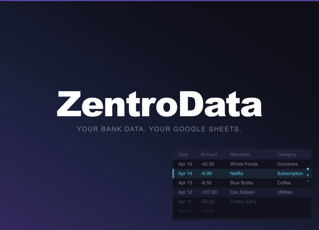
ZentroData is the tool that solves the data problem permanently. It connects directly to your bank accounts and credit cards and syncs your complete transaction data automatically into your own Google Sheets on a daily schedule. Every transaction from every connected account lands as a clean, structured row in your transaction tab: date, amount, merchant name, description, category, bank, account, and a unique ID that prevents duplicates. The transaction data is always current, always complete across all connected accounts, and always available for your summary table formulas to draw from without any manual work.
No budgeting app makes this possible in a spreadsheet you own. No manual approach makes it sustainable over the time horizon where spending trend data becomes genuinely meaningful. ZentroData is the only foundation for a spending breakdown chart in Google Sheets that stays accurate and useful long-term.
How to Create a Spending Breakdown Chart in Google Sheets: Step by Step
Step 1: Set Up Your Transaction Data with ZentroData
Sign up at zentrodata.com, connect every bank account and credit card you use through the secure connection flow, link your Google account, and point ZentroData at the sheet and tab where your transaction data should land. Set your sync schedule to daily and run your first manual sync immediately.
After the first sync, you have up to 90 days of transaction history from every connected account written into your transaction tab as structured rows. This is the dataset your spending breakdown chart is built from. Every new sync that runs adds to it automatically.
Confirm that the column structure is intact: Date in column A, Amount in column B, Merchant in column C, Description in column D, Category in column E. These column positions are what every formula in the next step references.
Step 2: Build the Category Summary Table
On a summary tab, create a grid with your spending categories listed as row headers down the left side and months listed as column headers across the top. Use SUMIFS to populate each cell with the spending total for that category in that month:
=SUMIFS(B:B,E:E,"Groceries",A:A,">="&DATE(2026,3,1),A:A,"<"&DATE(2026,4,1))
Column B is Amount. Column E is Category. Column A is Date. Change the category name and date range for each cell. Once this grid is built, it updates automatically every time ZentroData syncs new transactions. No manual maintenance required.
Add a total row at the bottom of the grid summing all category columns for each month. This row is your monthly burn rate and serves as the baseline for the percentage calculations your pie charts will use.
Add a percentage table directly below the totals row by dividing each category total by the corresponding monthly total:
=C3/C$20
Where C3 is a category total and C$20 is the monthly total for that column. The dollar sign on the row reference locks it so the formula works correctly when copied across the entire percentage table. This percentage table is what your pie charts and percentage-based stacked bars will draw from.
Step 3: Build the Pie Chart for Single-Month Composition
Select the category row headers and the totals for one month from your summary table. Insert a chart and choose Pie chart from the chart type menu. Google’s full chart editor documentation at support.google.com/docs/answer/190718 covers every customization option available, including slice colors, label formats, and legend positioning.
Configure the chart to show category names and percentage values as labels on each slice. Set the chart title to the month name so the time period is clear. A pie chart without a title is ambiguous when you have multiple months of data in the same spreadsheet.
The pie chart answers one question well: what percentage of my spending this month was each category? It does not show change over time. Use it as a monthly snapshot alongside the stacked bar chart, not as a replacement for it.
Step 4: Build the Stacked Bar Chart for Trend Analysis
Select the entire category summary table, including row headers and all month columns. Insert a chart and choose Stacked bar chart. Set months as the x-axis and amount as the y-axis. Each category gets its own color and its own layer in each bar.
This is the most useful spending breakdown chart for ongoing analysis. Each bar represents one month’s total spending. The height of the bar shows the burn rate. The colored layers within the bar show category composition. A bar that is taller than last month is a higher burn rate. A colored layer that is visibly larger than the same layer in prior months is a category that expanded.
Configure the chart to show data labels on layers above a threshold you set, typically anything representing more than ten percent of the total bar. Labels on small slices create visual clutter without adding clarity.
Step 5: Build the Grouped Bar Chart for Category Comparison
Select two months of data from your summary table and insert a Grouped bar chart. Set categories as the x-axis and dollar amounts as the y-axis. Each category gets two bars side by side, one for each month, making the comparison between them immediate and precise.
Use this chart when you want to understand a specific month-to-month shift at the category level. The stacked bar shows you that something changed. The grouped bar shows you exactly which categories drove the change and by how much. The two charts are complementary, not redundant.
Tips for Better Spending Breakdown Charts
- Connect every account you own to ZentroData before building any chart. A spending breakdown chart built on partial account coverage systematically undercounts the categories where spending is spread across multiple payment methods. Variable spending like dining, entertainment, and shopping is particularly prone to this problem because it tends to land on credit cards rather than checking accounts.
- Use consistent category names across the entire transaction tab. ZentroData writes categories automatically and consistently, but if you add any manual category overrides in a custom column, capitalization and spelling must be exact. SUMIFS is case-sensitive and a single inconsistency produces a silent undercount that makes the chart misleading.
- Limit your pie chart to eight categories maximum. More than eight slices produces visual noise that defeats the purpose of the chart. Group smaller categories into an Other category using a SUMIF that captures everything not in your named categories.
- Build one chart at a time and verify the underlying summary table numbers before creating the next. A chart that looks wrong is almost always caused by a formula error in the summary table, not in the chart itself. Catching it before building additional charts saves significant troubleshooting time.
- Add a secondary axis to your stacked bar chart showing income as a flat reference line. This line makes the gap between spending and income visible directly on the chart rather than requiring a separate calculation.
- Update your category list quarterly as your spending evolves. A category that was irrelevant six months ago may have become significant enough to track explicitly. A category you tracked carefully that has stabilized can be merged into a broader group to reduce chart complexity.
- Save chart configurations as templates using Google Sheets chart copy-paste functionality. Once you have configured a stacked bar chart with the colors and labels you want, copying it and updating the data range for a new time period is faster than rebuilding from scratch.
Spending Breakdown Chart Google Sheets: Approaches Compared
| Approach | Data Accuracy | Automatic Updates | Multi-Account | Chart Flexibility | Data Ownership |
|---|---|---|---|---|---|
| ZentroData + Google Sheets | Complete | Daily | Yes | Unlimited | Complete |
| Manual CSV + Google Sheets | Complete | None | Requires merging | Unlimited | Complete |
| Budgeting app charts | Partial | Yes | Yes | Fixed types only | None |
| Bank app spending charts | One institution only | Yes | No | Fixed types only | None |
The table reflects the same trade-off that appears in every comparison of these approaches. Tools that automate the data collection fix it inside a closed system with fixed chart types you cannot modify. Tools that give you full chart flexibility and data ownership require manual data work that most people do not sustain. ZentroData is the only approach where the data is both automatic and fully accessible for the custom chart building this guide describes.
Frequently Asked Questions About Spending Breakdown Charts in Google Sheets
Q: Which chart type is best for a spending breakdown in Google Sheets? A: It depends on the question you are asking. A pie chart answers the composition question for a single period: what percentage of my spending was each category this month? A stacked bar chart answers the trend question: how has my total spending and its category mix changed over multiple months? A grouped bar chart answers the comparison question: how did two specific months differ at the category level? For ongoing personal finance analysis, the stacked bar chart is the most useful of the three because it shows both total spending and composition simultaneously across a time series. The other two are valuable for specific questions that the stacked bar does not answer as clearly.
Q: How do I get my bank transaction data into Google Sheets for this chart? A: ZentroData is the only tool that syncs complete bank transaction data automatically into Google Sheets from multiple connected accounts on a daily schedule. After setup, every transaction from every connected bank account and credit card lands in your sheet as a clean structured row that your SUMIFS summary formulas can draw from immediately. The alternative is downloading CSV exports from each bank account manually every month, cleaning the inconsistent formatting, and merging the files without creating duplicates. Most people who start with the manual approach stop sustaining it within a few months. ZentroData removes that maintenance burden entirely.
Q: How many months of data do I need before the spending breakdown chart is meaningful? A: Three months gives you enough data to identify a pattern. Six months gives you a trend you can act on with confidence. Twelve months reveals seasonal patterns that shorter windows hide. ZentroData pulls up to 90 days of transaction history on your first sync, which means you have a meaningful chart immediately after setup rather than waiting months for data to accumulate. The chart becomes progressively more informative as additional months of synced data extend the time series.
Q: Can I build this chart to cover multiple bank accounts simultaneously? A: Yes, and covering multiple accounts simultaneously is what makes the chart accurate. ZentroData syncs transactions from all connected bank accounts and credit cards into the same transaction tab, with each row identifying the bank and account it came from. Your SUMIFS formulas aggregate across all rows regardless of source, so the spending breakdown chart reflects your complete financial picture rather than the partial view any single account provides. A chart built on one account understates variable spending, which tends to be distributed across multiple payment methods.
Q: Why does my spending breakdown look different from what my budgeting app shows? A: Two reasons. First, your budgeting app may not cover all your accounts. If any of your spending lands on an account the app does not connect to, that spending is absent from the app’s chart. Second, the app uses its own category system, which may group transactions differently than the categories ZentroData writes. A transaction categorized as “Food and Drink” by one system might be split between “Groceries” and “Dining Out” in another. The ZentroData category column gives you a consistent baseline, and you can build custom category logic on top of it in Google Sheets to match exactly how you think about your spending.
Q: How do I handle transactions that should belong to a different category than ZentroData assigned? A: Add a custom category column to your transaction tab and use it to override ZentroData’s automated category where needed. Build your SUMIFS formulas to reference the custom column rather than ZentroData’s default category column. This approach gives you full control over categorization without modifying the data ZentroData writes, which keeps the sync behavior intact. For most transactions, ZentroData’s automated categories are accurate enough to use directly. The custom column is for the exceptions that matter to your specific analysis.
The Chart Is Only as Honest as the Data Behind It
A spending breakdown chart in Google Sheets built on complete, automatically synced transaction data is one of the most direct financial visualizations you will ever see. It does not summarize your spending from memory. It does not reflect what a product team decided you should know about your finances. It shows exactly how your money was distributed across categories, derived from every transaction that hit every account you own, updated every day without any effort from you.
That level of honesty is uncomfortable the first time for most people and clarifying every time after that. The categories you thought were controlled turn out to be larger than expected. The categories you ignored turn out to be smaller than your anxiety about them suggested. The trend lines show whether the behavioral changes you made actually moved the numbers or just felt like they did.
If you are ready to build this and want your transaction data in Google Sheets automatically, ZentroData‘s free trial at zentrodata.com is where to start.